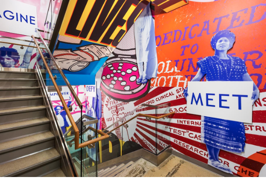
I focused on Natasha Jen because I found her work very bold and colourful. I like the different typography elements as they match well with the image. I think, the layout and techniques of Natasha’s work looks good as it has a unique style and this is which I need to focus for my final book. I found the different colours really effective as they look interesting and simple. I like the bold typography good as they look distinctive. I will draw my typeface into my own style as this is which I need work on.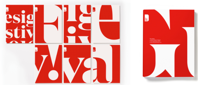
I have focused on Eddie Opara because he has used simple colours and good grid systems.I like the different elements of the typeface which he used in his work because of the pace and design. I really think the colour of the imagery works well as it looks unique and simple. I like the different textures and patterns of Eddie Opera’s work as it looks creative.There are a lot of patterns used which describe my personality and style.